Below are examples of print design projects I've had the pleasure of working on while serving clients in the greater Pittsburgh area. Each project highlights my focus on creating visually compelling materials that leave a lasting impression.
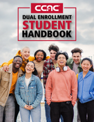
Advertisements, Marketing Materials, & other Print Designs from CCAC
These print materials for CCAC were designed to inform, engage, and promote the college’s offerings across various audiences. From flyers and print advertisements that highlight key programs and initiatives to a comprehensive handbook providing essential student resources, each piece was thoughtfully crafted to align with CCAC’s marketing objectives. Additional materials, such as posters and other print collateral, were developed to enhance visibility and effectively communicate important information.
Print Campaigns for Armstrong Comfort Solutions
These print projects for Armstrong Comfort Solutions highlighted their services and values through diverse formats. From business cards designed to help employees memorize guiding principles, to stickers and postcards celebrating the opening of a new branch with community-focused coupons, each piece was crafted to align with strategic goals. Additional materials, such as posters and other print collateral, were created to effectively communicate with and engage customers.
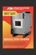
Asphalt/Sealant Testing Print Advertisements for ATS
This series of print advertisements was created for ATS to showcase their asphalt and sealant testing services in trade publications and industry-specific magazines. The ads used a clean, professional layout to highlight the importance of accurate testing for quality materials. Each ad was tailored to the target audience, focusing on ATS’s technical expertise and ability to deliver reliable testing results. I aimed to convey trust and credibility, ensuring that the print ads effectively captured the attention of industry professionals and decision-makers.
Creep Testing Print Advertisements for ATS
These print advertisements were designed to highlight ATS’s advanced creep testing services for industrial materials. The designs focused on emphasizing the precision and reliability of ATS’s equipment in ensuring accurate long-term material performance evaluations. Targeted for placement in trade magazines and industry journals, the ads used professional layouts and bold typography to appeal to engineers, manufacturers, and decision-makers in relevant industries. The messaging underscored ATS’s expertise and commitment to high-quality creep testing solutions.
Process Heating Print Advertisements for ATS
These print advertisements were created to showcase ATS’s cutting-edge process heating solutions, emphasizing precision, efficiency, and innovation. Designed for trade publications and industry magazines, the layouts featured bold visuals and clear messaging targeted at professionals in industrial manufacturing, research, and development. The ads highlighted ATS’s expertise in delivering reliable process heating systems tailored to meet the most demanding applications.

Christmas Party Invitation and RSVP Cards
For this local business’s Christmas party, I designed a festive invitation and RSVP card to capture the holiday spirit. The design included cheerful colors, holiday-themed illustrations, and elegant typography to convey warmth and joy. I created multiple RSVP card options to give the business flexibility in how they communicated the event details to their guests.

Dental Rack and Business Cards
For this project, I designed both a rack card and a matching business card to work together as part of the business's promotional strategy. The rack card provided detailed information, while the business card ensured the brand remained memorable with a clear, clean design. Both elements were designed to reflect the business's professional identity.

Wedding Package Print Materials
I designed a custom wedding invitation suite, including invitation and insert cards. The project involved working closely with the couple to ensure that the design reflected their personal style and wedding theme. I focused on typography, color palettes, and layout to create an elegant and cohesive suite that made a lasting impression on their guests.

Detail Genies Business Card
This business card was designed for Detail Genies, a client offering high-quality auto detailing services. The design featured a bright blue genie mascot to capture the playful yet professional nature of the brand. The genie was incorporated as a focal point to add personality and make the card memorable. I paired this with clean, bold typography and a modern layout to ensure the business’s contact information stood out clearly. The overall design was created to appeal to potential customers while reflecting the brand’s unique and approachable identity.

Floral Menu Design for Local Diner
This menu design for a local diner was created to reflect a welcoming and homey atmosphere. I used a floral design with soft, muted colors to convey warmth and charm, while ensuring the menu was easy to read and navigate. The typography and layout were carefully selected to reflect the diner’s friendly and cozy environment.

Destination Wedding Passport Invitation
For this destination wedding, I designed a passport-style wedding invitation to set the tone for an exciting travel-themed celebration. The design included an invitation, RSVP card, and return labels, all structured like a passport for a fun and unique experience. The use of custom illustrations and vintage-style typography reflected the adventure and excitement of a destination wedding.

Basketball Booster Thank You Card
For the Butler Golden Tornadoes basketball booster club, I designed a dynamic and energetic thank you card. The design incorporated bold typography and team colors, reflecting the school spirit and enthusiasm of the basketball program. The card was designed to thank supporters while also maintaining a strong connection to the team's identity.

Volant Rack Card
I designed a rack card highlighting local attractions and activities for a small town, showcasing what makes the area unique. The card was designed to be visually striking and informative, with a clean layout that made it easy for tourists to quickly find key information. Photographs of local sights, along with clear, concise text, helped communicate the town’s offerings.

Succulent Wedding Invitation Suite
For this wedding, I designed a succulent-themed invitation suite, complete with an invitation, RSVP card, and informational card. The design incorporated beautiful watercolor succulents paired with soft pastel tones to create a calming, nature-inspired aesthetic. The layout was carefully crafted to provide all necessary details while maintaining a fresh and contemporary feel.

Fall Gold Foil Wedding Invitation Suite
This elegant wedding invitation suite was created with a classy fall aesthetic in mind, featuring a gold foil design for a luxurious touch. The suite included an invitation, RSVP card, and return labels, all coordinated to evoke the warmth and richness of autumn. I used a sophisticated color palette of deep slate, gold, and cream to create an inviting and high-end feel.

Sports Issue Cover Design
For the sports issue of The Rocket, I designed a dynamic and energetic cover that highlighted the university’s athletic achievements. I used strong, action-oriented imagery alongside bold typography to capture the excitement of the sports season. The layout was designed to engage readers and draw attention to the coverage of student athletes.

Award-Winning "A House Divided" Cover Design
For this cover design, I crafted a visual representation of the theme “A House Divided” for an issue discussing political divides. The design won a Society of Professional Journalists (SPJ) award and utilized bold typography and imagery that symbolized division and conflict in a creative, yet respectful, manner.

Help Wanted Ad for The Rocket
This ad was created to recruit new members for The Rocket, the student-run newspaper at Slippery Rock University. I focused on creating a visually appealing and informative layout to attract students with an interest in journalism. The ad’s design highlighted the benefits of working with the paper while maintaining a clean, professional look.

"Sex and Love" Cover Design
This cover design explored the topic of love and relationships, balancing bold graphics with thoughtful symbolism. The design featured striking visuals that captured the essence of the theme while also appealing to the student audience. I used a modern, edgy style with vibrant colors to create a memorable visual impact.

Contribute to The Rocket Ad
This advertisement was designed to encourage students to contribute their work to The Rocket, the student-run newspaper. The layout was crafted to be both eye-catching and informative, emphasizing the benefits of contributing to the paper and the opportunities for student involvement in journalism. I used vibrant colors and bold, easy-to-read typography to create a design that appealed to students, making the message clear and engaging.

"Get Involved" Ad for The Rocket
This advertisement was designed to encourage students to get involved with The Rocket. I focused on creating an engaging and inviting layout that emphasized the opportunities available to students. The design featured vibrant colors and bold typography to catch attention while making the message clear and inviting.


